
Ventus Power
Ventus Power is an offshore wind consultancy specialising in senior leadership teams, package and project management services and support for projects for development and execution projects in Asia, Europe and Australia.
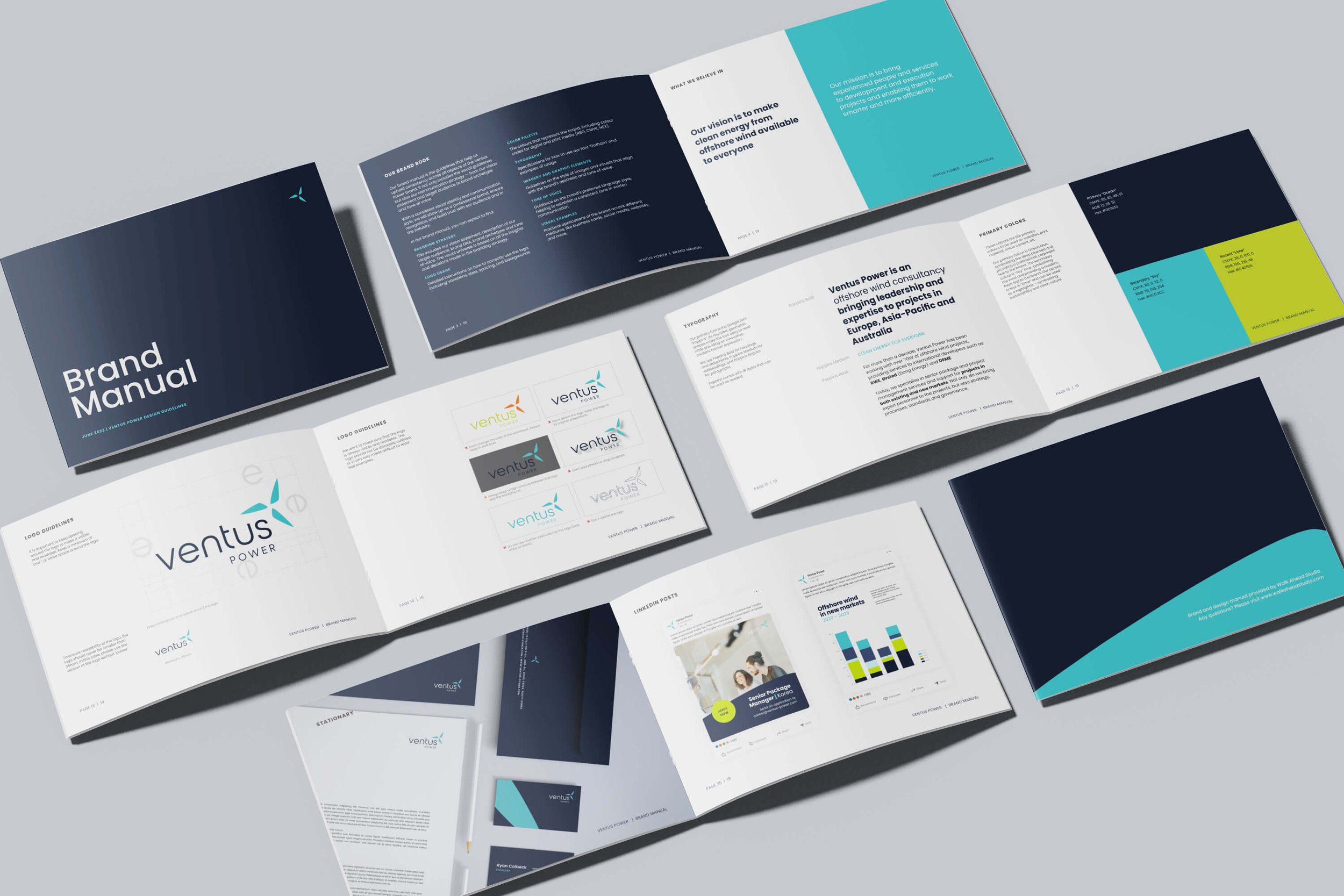
The project included a branding strategy, visual identity, and website design and development. Visit www.ventus-power.com to see the live site.
Project Focus
Strategy
Branding
Logo design
Website

background and challenge
Ventus Power wants to help projects move into new markets. They want to meet their clients where they are and help them move forward – whether helping projects in existing markets or being the front mover and expanding to new markets.
We wanted to make a brand that spoke to the offshore wind industry – but remain different from other renewable energy brands. Choosing a focus on innovation, confidence, and being approachable enabled us to find a style and tone that would attract both young consultants and build trust with experienced developers.


Logo and style
The primary logo consists of the name and an icon. The turbine represents offshore wind and energy. The blue colour symbolises water and the sky, waves and wind. The Lime green represents the innovative approach with a focus on sustainability and clean energy. The name is written in lowercase to appear approachable and down-to-earth – yet still modern and professional.
Social media examples


Result and impact
The project included a brand strategy workshop, full development of logo and visual identity, website design and development, including ad hoc graphic design tasks. Visit www.ventus-power.com to learn more.